
Improving Timeline design and performance
You might have noticed that things look a bit different in your Timeline these days, thanks to a slew of design updates we recently made that should make editing in Scenery more efficient and enjoyable.
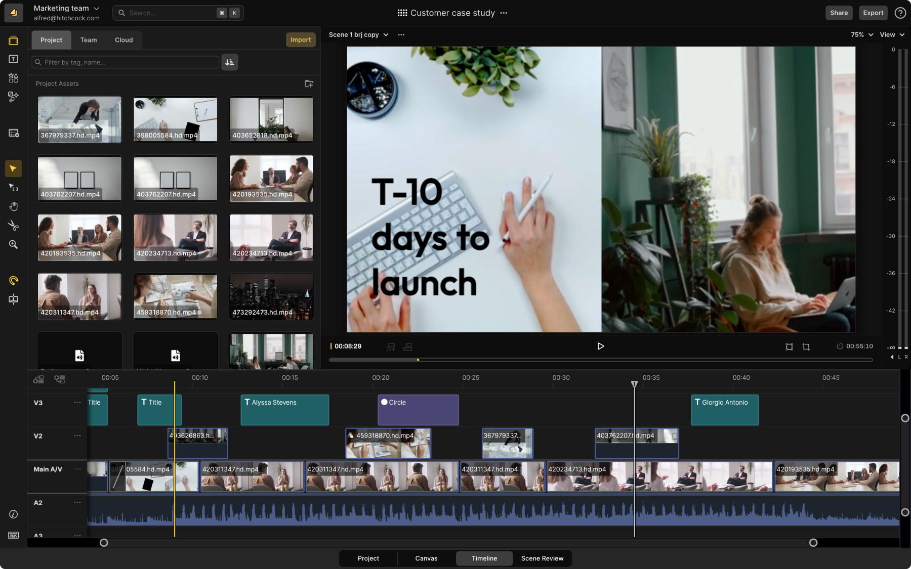
If you’ve been in and out of Scenery for the past few weeks, you’ve likely noticed a series of design improvements we’ve made to items on the Timeline (“clips”) that will make your video editing workflow a bit smoother. We’ve also made a bunch of under the hood changes that improved performance as you’re editing, with frames per second increasing by up to 70% on especially large projects.

On the design side, here's a quick overview of what’s new with the clips, with more details on each change further down in the post:
- New colors to denote clip type. Quickly see which clips are videos, titles, subtitles, and shapes with specific colors for each clip type.
- Improved boundary visibility and trimming. Rounded edges make it easier to see where your edits are, especially when you split a clip.
- Clearer titles and information. See clear filenames, title copy, subtitles, and more directly on the clip.
- Improved display of animations, effects, and transitions. Clearer icons on clips to help you spot modifications applied to your clips.
New colors to denote clip type
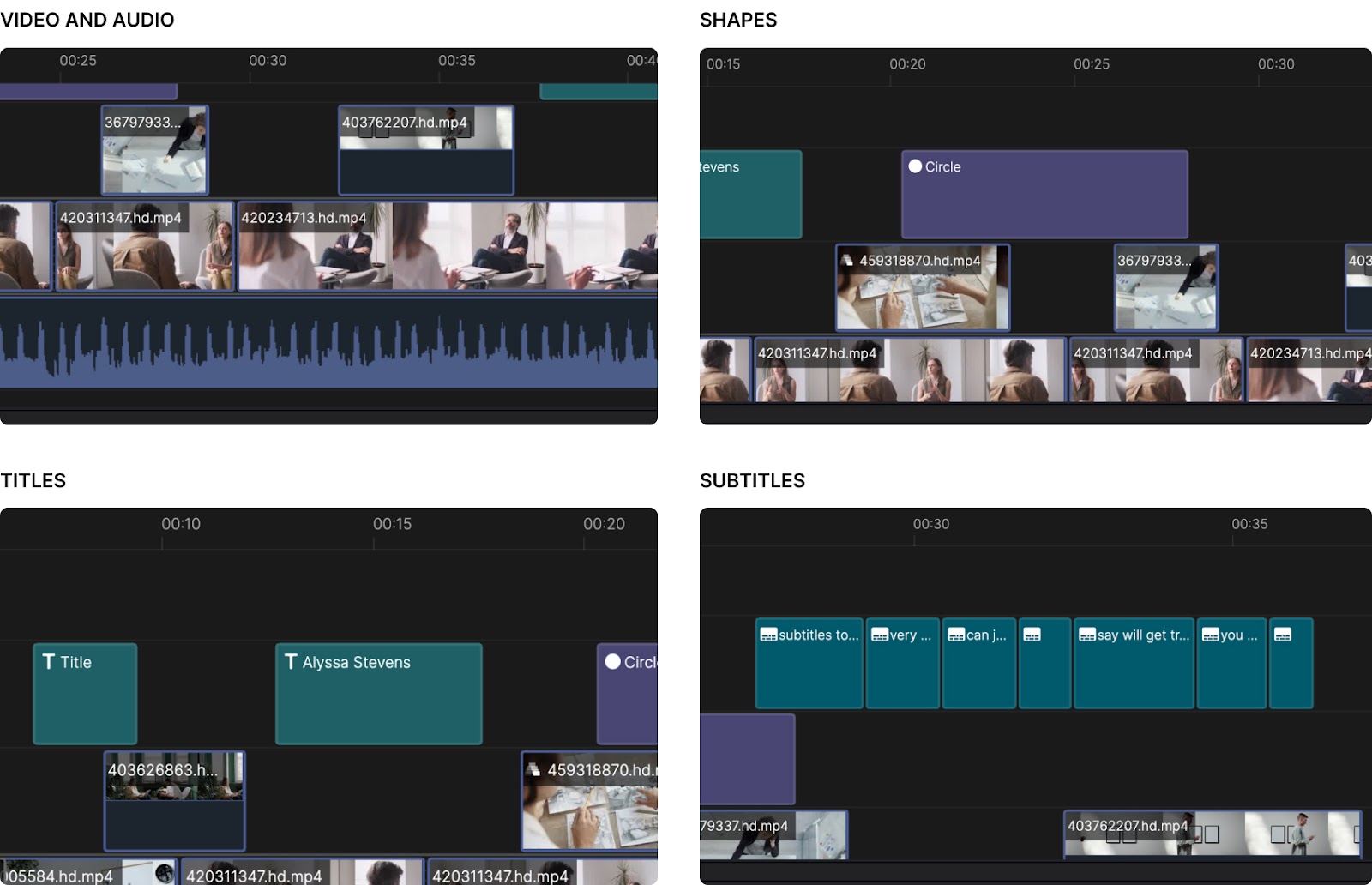
When you’ve got a lot going on within your Scenes and a wide array of media types in the Timeline, it can be tricky to identify where you placed that title or where that shape is. And so, to make it easier to quickly scan and see clip types, we’ve color coded them:
- Video and audio clips are blue
- Shapes are purple
- Titles are a nice shade of green
- Subtitles are teal
Improved boundary visibility and trimming
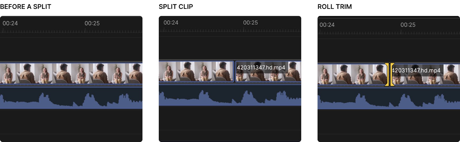
Another small but mighty update: we've added some rounded edges to clips so they’re more aesthetically pleasing but also so it’s easier to identify clip boundaries and trim. We've also increased the space between clips and tracks so you can more easily see where things start and end.
Clearer titles and information about clips
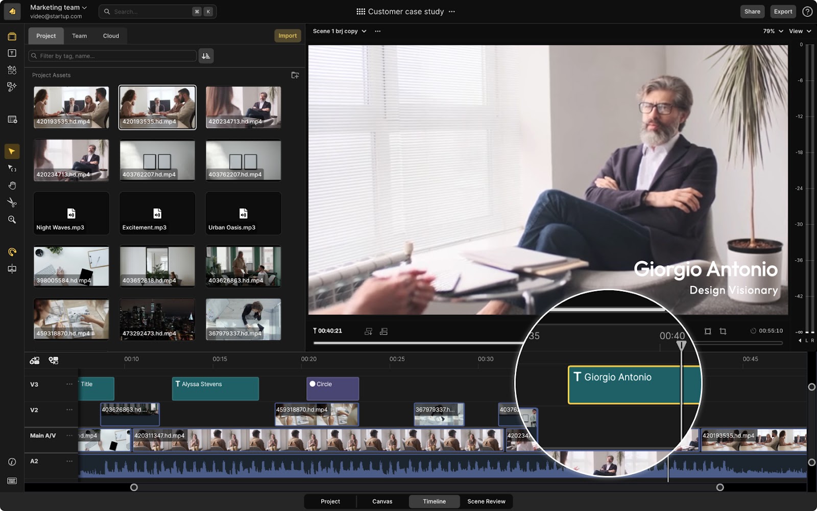
We’ve also added more specificity and detail to the titles on clips. For example, now with title clips you’ll see words you’ve set for that title directly on the clip, instead of just a title icon.
Improved display of animations, effects, and transitions
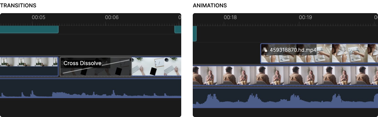
Finally, we made it more apparent when clips have transitions, effects, and animations applied with clearer icons on clips and cleaner transition object in the Timeline.
How to share your feedback
If you’ve got additional changes you’d like to see, join us in Slack and let us know or shoot us an email at contact@scenery.video. We’d love to hear your feedback.
